Stacks Image 143

Explore xSight's User-Friendly Interface

xSight’s user-friendly environment is a popular feature of xSight.

The process begins with the screen below.

xSight opening screen

This is the Start-up screen where the user starts the measurement after loading a sample. The user selects the channel sample well where the sample is loaded (channel 1 in the example above), then enters the sample name and sample refractive index. The default viscosity, volume, and laser color will already be selected but they can be changed. Then the user simply presses the big orange “START” button to begin data acquisition and analysis.

As data is acquired, it automatically populates the data displays in each of the tabs: Particle Distribution, Morphology, Concentration, Velocity Profile, Holograms, and Statistics. The user can click each tab as the data analysis is taking place to see the accumulation of data in each of the formats. Once the data analysis is complete, the user can view the summary report on the Report tab or view a comparison of different data sets on the Comparison tab.

Click on each tab below to see the many ways to view data on xSight’s intuitive user-friendly interface.

    Particle Distribution
    Stacks Image 334

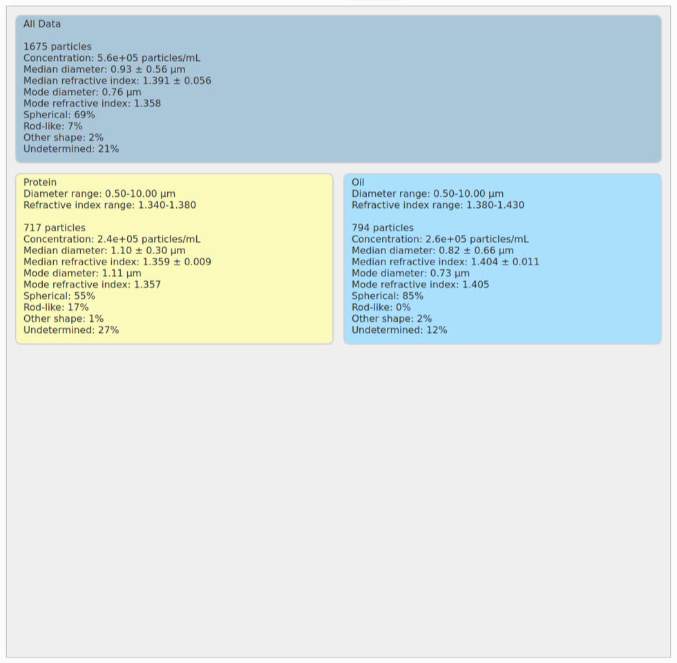
    Above is a typical Particle Distribution plot of a sample that contains protein aggregates and silicon oil emulsion droplets. This plot has 3 regions:

    (1) The main body of the plot is a scatter plot where the x-axis is particle size and the y-axis is particle index of refraction. Each point on the plot represents a single particle. The color represents a heat map corresponding to the density of particles in each region. Warm colors signify higher particle density and cool colors represent lower particle density. The user can create a “region of interest” box around areas of the scatter plot where particles of a particular size and index can be monitored. In the example above, there is a blue box around the region where oil droplets are expected and a yellow box around the region where protein aggregates are expected. These boxes allow the user to standardize regions for analysis; for example, to simultaneously measure the concentrations of multiple different species present in the sample, even when the particles are the same size. These boxes can be stored for future use. The boxes can be designated by “drop-and-drag” to the desired location and size, or entered numerically.

    (2) Above the scatter plot is a density plot of the size of particles present in the sample. The size distribution of all particles present in the sample is shown, as well as the size distribution in any user-enterable Region of Interest boxes that have been added. The density distributions of the regions of interest are color coded to match the color of each box.

    (3) To the right of the scatter plot is the density plot of index of refraction of the particles present in the sample. Since particles of different composition have different indexes of refraction, this axis represents the compositions of the different species present in the sample. Again, the distribution of the total composition is shown as well as the distributions of the Region of Interest boxes. In the example above you can see both the blue peak (oil droplets) and the yellow peak (protein aggregates).

    Morphology
    Stacks Image 363

    Above is a typical Morphology plot of a sample that contains protein aggregates and silicon oil emulsion droplets. As with the Particle Distribution tab, the Morphology plot has 3 regions.

    (1) The main body of the plot is a scatter plot where the x-axis is particle size and the y-axis is particle index of refraction. Each point on the plot represents a single particle. In contrast to the Particle Distribution plot, the colors represent the shape of the particles. The 3 colors represent three different particle shapes: (1) cyan points represent spherical or near spherical particles; (2) gold points represent rod-shaped particles; and (3) orange points represent irregularly shaped particles. The gray points represent particles where the signal of the hologram was not sufficient to determine the shape of the particles.

    (2) Above the scatter plot is a density plot of the size of particles present in the sample, as well as the size distribution of each particle shape.

    (3) To the right of the scatter plot is the density plot of index of refraction of the particles present in the sample. Since particles of different composition have different indexes of refraction, this axis represents the compositions of the different species present in the sample. Again the distribution of the total composition is shown, as well as the distributions of each particle shape.

    Concentration
    Stacks Image 370

    Above is a typical Concentration plot of a sample that contains protein aggregates and silicon oil emulsion droplets. The concentration is shown as a plot of concentration versus particle size. The user can decide whether to view the particle concentration in 1 µm size bins or as cumulative concentrations. The concentrations are provided for the total of all particles in the sample and for any Regions of Interest entered in the Particle Distribution tab. The concentrations from the plot are also provided in a table below the plot.

    Velocity Profile
    Stacks Image 376

    The Velocity Profile tab gives the user a quick way to verify that everything is running as expected. The velocity profile plots the velocity of each particle as it flow down the microfluidic channel in xCell, the custom, disposable, microfluidic sample chip designed for xSight, versus the height of each particle above the focal plan. xSight assures that the sample flows through the channel with uniform Poiseuille flow which is represented by a parabola. As long as the lower edge of the parabola is within the upper and lower limits, the distance from the focal plane is acceptable to deliver accurate results.

    Holograms
    Stacks Image 382

    The Holograms tab provides a raw hologram for each of the particles that is measured. Each hologram can be shown with a label indicating the size (d) and refractive index (n) of the particles. The user can scroll through raw holograms which can be sorted by time, size, or refractive index in either ascending or descending order. The image above shows a group of holograms sorted by size representing particles that range from 2.18 - 2.54 µm. The low index holograms (n=1.346-1.353) represent particles that are protein aggregates. The holograms where n=1.405-1.410 represent particles that are silicone oil emulsion droplets.

    Statistics
    Stacks Image 388

    The Statistics tab provides the measurement statistics for all of the particles measured and for the regions of interest entered in the Particle Distribution tab, including size, refractive index, morphology, and concentration. The background color of the panel for each set of statistics is color-coded to match the color of the user-entered region of interest. The dark blue panel provides the statistics for the entire sample, including all particles. In this case, the yellow panel refers to the statistics for region of interest designating protein aggregates and the light blue panel refers to the statistics for the region of interest designating silicone oil emulsion droplets.

    Report
    Stacks Image 394

    The Report tab shows a summary report containing the information from all of the other tabs. In this tab the user can scroll through all of the different results and export the report as an HTML file.

    Comparison
    Stacks Image 130

    The Comparison tab allows the user to select up to 4 different data sets for comparison. Each run is shown on the same plot in a different color. In the example above, the orange dataset represents a sample of protein aggregates and silicone oil. The cyan dataset represents a sample of protein aggregates that does not contain silicone oil. The probability density of the particles as a function of size, above the scatter plots, shows that it is not possible to distinguish protein aggregates from silicone oil droplets by size alone. The probability density of particles as a function of refractive index, at the right of the scatter plot, shows peaks at two different refractive index regions. There is a peak in both samples centered at n=1.36, representing protein aggregates, and a second peak in the orange samples centered at n=1.405, corresponding to silicone oil droplets.

For additional data formats and the ability to compare xSight data with data acquired on other instruments, Spheryx has partnered with Lumetics, so that xSight data also can be viewed in the Link software package.

© 2024 Spheryx, Inc. All rights reserved. | Contact Spheryx | Website by TesslerDesigns | Privacy Policy | Cookie Policy | Terms and Conditions | FCOI Policy

Share this page: